SAP LABS, INDIA
Personal Finance Management for Indian consumers
An Android app that parses through SMSes sent by banks and visualizes your financial information in an easy to understand manner
The HYPOTHESIS
This was before the proliferation of smartphone based wallets. The thinking was that most people in India with smartphones did not access their banking / financial information from their mobile device because of a perceived lack of information security.
THE OPPORTUNITY
SAP Labs India ran a program called the "Billion User Initiative" which aimed at disrupting emerging markets like India with new and relevant products. All major Indian banks send transaction confirmations through SMS. The idea was - What if we could enable consumers to see their financial information on a smartphone app without having to connect with internet banking credentials.
My Role
I joined SAP India as a full time Senior UX designer, and my role in this project was to validate this hypothesis and lead the end to end interaction & visual design for the product.
understanding personal finance management
The project did not really have a significant research budget and was in a 'proof of concept' mode. However, I decided that it was necessary to get brief insights into how people managed their finances before any other activity. I conducted a survey to achieve this.
The results of the survey proved that the hypothesis behind the idea was sound and the opportunity existed. It was clear it had to be an Android based app, as most participants used Android phones.
- Debit card was the most often used mode of spending, which meant people received SMS notifications for those transactions.
- People were reluctant to add transactions manually and automated parsing of SMSs was perceived to be clever
- Auto-categorisation of expenses, budgeting, bill reminders and analytics were some of the features participants felt were integral to such a product
SPENDWELL
A simple, secure app that provides a consolidated financial overview and enables users to track expenses and identify patterns
INFORMATION ARCHITECTURE
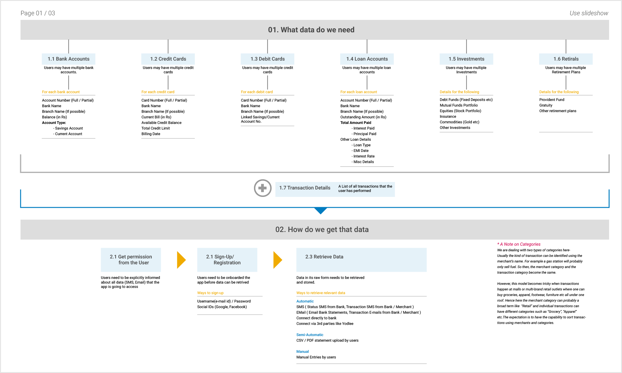
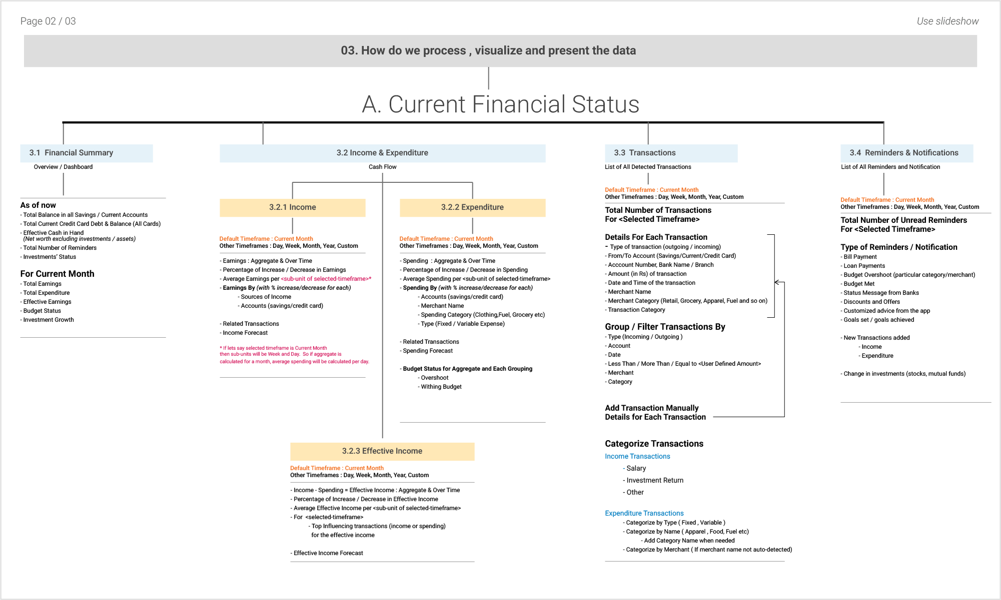
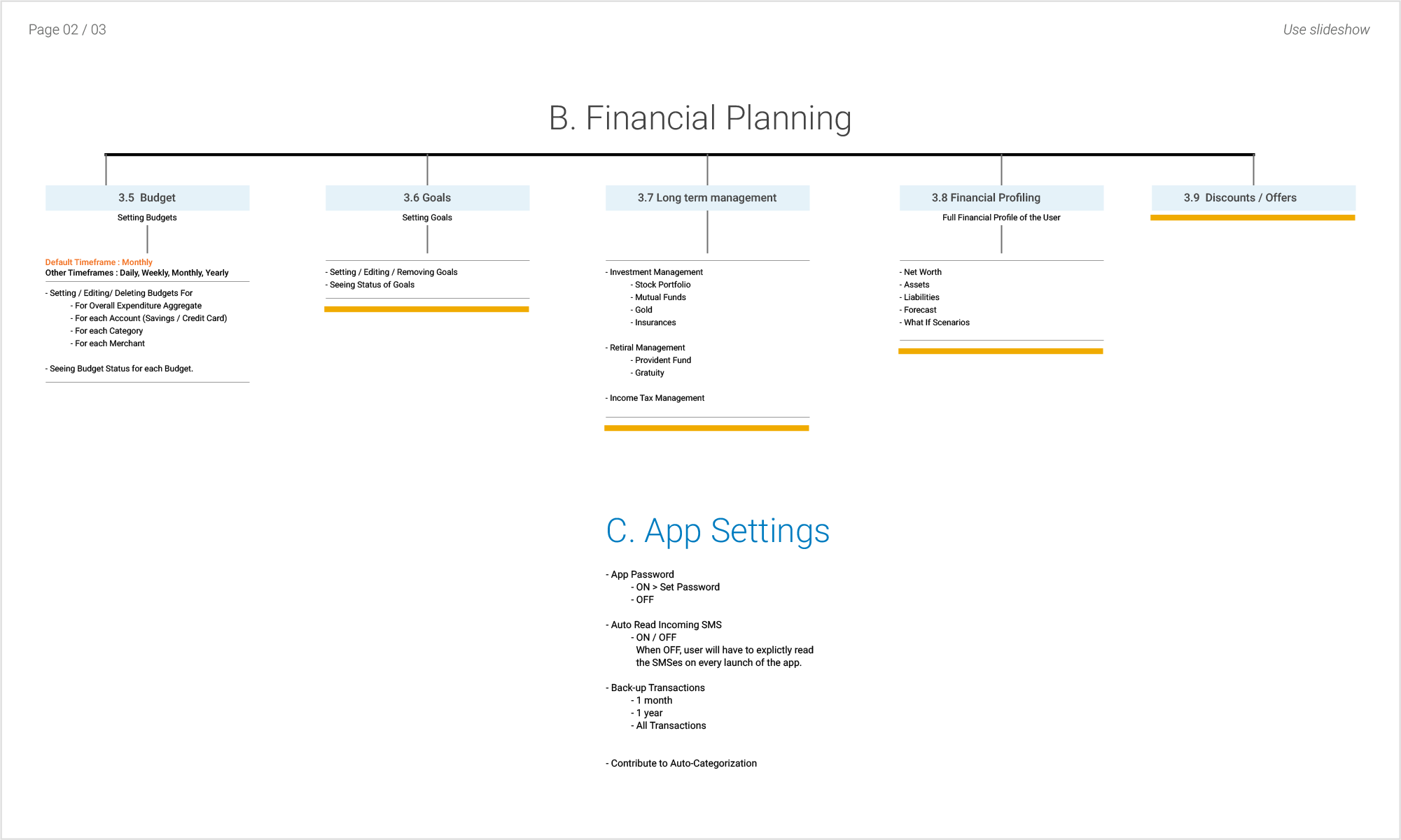
With the idea more or less crystallised, the next activity was to develop an information architecture and think about making a user's journey through the app, seamless. The information architecture is divided into data acquisition and visualisation.
Wireframes
Once the information architecture was finalized, the next step was to quickly draw out all the wireframes and workflows as paper prototypes
Mockups
Onboarding
The user onboarding process involved creation of an account, after which the app scans user's SMSes and identifies relevant data.
Financial Summary
The home screen provides a quick financial summary for the current month, pattern of expenditure and also a comparison of the expenses to the previous month.
Viewing expenses from different perspectives
One of the most important features of the app was its ability to auto-categorise expenses. Users could also view the expenses grouped by merchant. Additionally users could also add an expense (or income) manually.
Categories
Obviously, there would be some transactions which the system would not be able to categorise automatically. In such a case, users also had the ability to categorise transactions manually and also create new categories. Once done, future transactions from the same merchant would automatically be assigned appropriate categories.
Reflections
A very interesting domain to work in, but unfortunately the project was discontinued for various reasons. However, this project provided me with an opportunity to expand a simple hypothesis into a potential product idea rapidly. A lot of the features that were planned then, are now seen in almost every finance management app.


